

Executives rarely need more charts. They need clarity: what is happening, why it matters, what will happen next, and what decision is required. Data storytelling is the discipline of turning analysis into a narrative that guides busy stakeholders from context to action without losing accuracy. When done well, it reduces debate about numbers and increases alignment on priorities. Many professionals develop this capability alongside technical learning such as a data analyst course in Pune, because communication becomes as important as modelling.
Why executives respond to narratives, not dashboards
Attention is limited, decisions are continuous
Leaders make dozens of decisions across revenue, risk, operations, and hiring. They cannot explore every filter or interpret every metric definition. A narrative gives them a guided path: it frames the question, highlights the signal, and makes the trade-offs explicit.
A narrative creates “decision readiness”
A dashboard answers “what”, but a story answers “so what” and “now what”. Executive decision making improves when insights are packaged with:
- A clear decision statement (approve, prioritise, pause, invest)
- The few metrics that matter for that decision
- Confidence level and key assumptions
- Impact range (best case, expected, worst case)
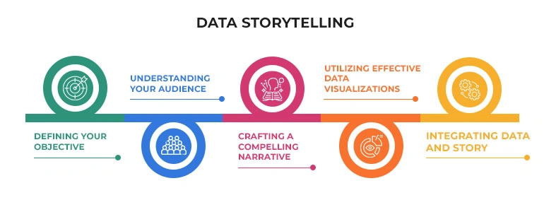
A practical structure for executive-facing data stories
Start with the decision and work backwards
Begin by writing a one-line decision question, such as: “Should we shift budget from Channel A to Channel B next quarter?” Then design the story to support that decision. This keeps you from over-explaining and helps you select only the most relevant evidence—an approach often reinforced in a data analytics course that emphasises business outcomes.
Use a reliable narrative arc
A simple, repeatable arc works across most domains:
1) Context: What is the business goal and what period/customer segment are we discussing?
2) Tension: What changed, what is underperforming, or what opportunity emerged?
3) Evidence: What data supports this, and what alternatives were tested?
4) Recommendation: What action is proposed and why now?
5) Expected impact: What KPI movement should we expect and by when?
6) Risks and mitigations: What could go wrong and how will we monitor it?
This arc prevents “analysis dumps” and helps stakeholders follow the logic without needing to inspect every intermediate step.
Make the “one message” unmissable
Every story should have one main message a leader can repeat in a meeting. If your story has five messages, it effectively has none. Use a headline that states the takeaway, and ensure every chart or table supports it. If a visual does not serve the main message, remove it.
Turning analysis into an executive narrative
Translate metrics into business language
Executives think in outcomes: margin, growth, churn, cycle time, compliance, and risk exposure. Convert analytical metrics into business terms:
- Replace “model AUC improved” with “we can identify high-risk churn customers earlier”
- Replace “variance increased” with “forecast uncertainty widened due to demand volatility”
- Replace “p-value significant” with “the uplift is unlikely to be random, but small”
If you learned statistical methods through a data analyst course in Pune, the next step is learning to explain them in decision language while preserving integrity.
Show comparisons, not raw numbers
Executives decide through contrasts. Use before/after, control/test, target/actual, and cohort comparisons. Also make drivers visible:
- Break down revenue change into price, volume, and mix
- Break down churn into onboarding, product usage, and support experience
- Break down delay into capacity, handoffs, and rework
Put uncertainty on the page
Avoid false precision. Provide ranges and confidence cues:
- Expected impact: +2% to +4% conversion
- Assumptions: stable pricing, no major competitor promotion
- Sensitivity: “If CPC rises 10%, ROI drops by 0.8 points”
A good data analytics course often teaches forecasting and experimentation, but the executive skill is presenting uncertainty without creating confusion.
Delivery formats and habits that work in boardrooms
Use the “one slide + appendix” approach
A strong pattern is:
- One executive slide: decision, key insight, recommendation, impact, next steps
- Appendix: supporting charts, definitions, methodology, and deeper cuts
This protects executive time while maintaining traceability for scrutiny.
End with clear next steps and owners
A story is incomplete without operational closure. Close with:
- Action list (3–5 items)
- Owner for each action
- Timeline and success metric
- Monitoring plan (what you will check weekly)
Conclusion
Data storytelling for executives is not about making analysis sound dramatic. It is about making decisions easier, faster, and safer. Anchor your narrative on a single decision, guide the audience with a clear arc, translate metrics into outcomes, and be explicit about uncertainty and trade-offs. Whether you built your foundation through a data analyst course in Pune or sharpened your business framing through a data analytics course, the advantage comes from consistently structuring insights as narratives that lead to action.
Contact Us:
Business Name: Elevate Data Analytics
Address: Office no 403, 4th floor, B-block, East Court Phoenix Market City, opposite GIGA SPACE IT PARK, Clover Park, Viman Nagar, Pune, Maharashtra 411014
Phone No.:095131 73277